Interview with Megan Van Wagoner
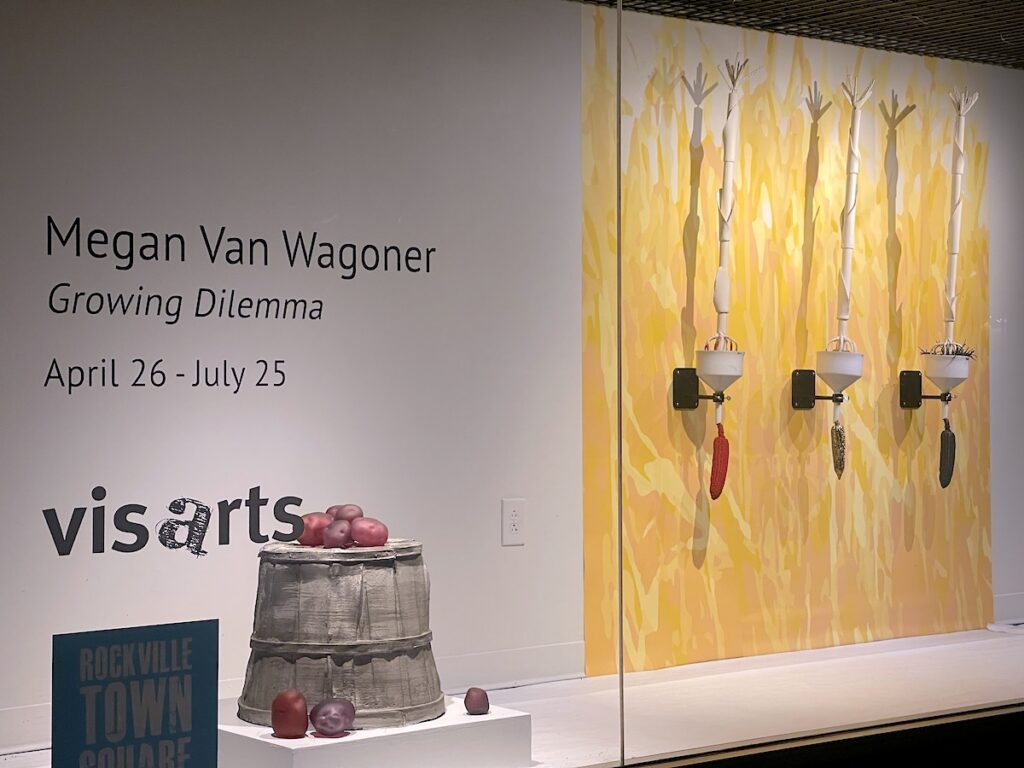
Growing Dilemma An interview with Megan Van Wagoner So the first question, would you please introduce yourself? I’m Megan Van Wagoner. I’m an artist living in Tacoma Park and have been working in the DC area for the last 20 years. The title of your work in the pod space is called Growing Dilemma. Would you talk about that, why you chose that title and the theory behind it? Growing Dilemma is a body of work that sort of grew out of my interest in vernacular architecture and what’s happening with agricultural land. I had started out by documenting barn structures in the Midwest, and I was printing them on clay trying to preserve some of the imagery that exists in a sort of vernacular agricultural architecture space. In doing that, you kind of get closer to what’s going on in agriculture and how land is being used, and that’s where this work really came from. It’s sort of my response or thought or meditation on how we use and value land, and the outputs of that land, so in this case, produce or agricultural products. And of course, it’s about growing, but part of it is about the growing need for food perhaps or those outputs, as well as the dilemmas that they cause. You’re a ceramicist and web designer, did these mediums come together for you in any way for this exhibition? I studied ceramics and came to be interested in ceramics again, vernacular objects, the things that we surround ourselves with every day, so pottery was really interesting to me. Then I sort of found that I had this broader interest in communicating narrative with people or sharing my take on various subjects. So, when I went to grad school I studied sculpture and was really digging more into the sort of fine art end of ceramics. Of course, when I got out of there, I needed a job, and I really found a parallel between what graphic designers do and what potters do. They are making things that are meant to have a function while also having aesthetic value because to do their job well they have to be aesthetically pleasing. That was the parallel between those two but this happens in other areas of my work as well, like typography, which is a particular interest of mine in graphic design. It has come into the work through making labels because I’m really interested in objects and the narrative that objects hold. However, this was the first time I sort of made digital imagery to work with objects. The custom wallpapers that line the back of that space are to help provide context for the objects, perhaps. I realized I give a lot of long-winded answers. But I think that like more context is probably better for understanding this level of work because it’s very layered, it’s very complex work like it’s not just one solid idea of just like ‘I’m non-binary and I want to see myself as like an icon’. I think it’s just understanding Latinx families, understanding women, understanding the queer community and being trans, and just many moving factors. So, you might have answered this a little bit, but what is it about ceramic that makes you feel it is the best medium for investigating American agriculture? Part of it is that the history of ceramics is one that is based in function. One of the things I love about ceramics is that it’s a medium which has historically been both form and two-dimensional image, so there are historic examples of sculpture as well as pots which are three-dimensional forms that are covered in imagery. I love that about it. Now for me, the physical objects that I make are much more permanent versions of everyday things. When I make a corn cob I cast it in ceramic slip and I fire it, through that process I’m taking something really impermanent and turning it into a medium that, for all intents and purposes, will be here for another 10,000 years. Now of course I struggle with that because I’m making something that doesn’t disintegrate really, it can break of course, but as a chemical substance, it’s a very permanent material. That’s why I think taking these objects and recreating them with other materials is so important. It’s similar to the glass potatoes and the cast ceramic objects like the corn. There’s also cast metal, so the basket trio that goes with the Three Bushel Monte piece is cast aluminum, but it’s really about taking something that is otherwise disposable or ultimately trash or will be taken back by nature and converting it into something that has a lasting life. That actually goes into one of my other questions, you’re working with metal, glass, and ceramic. Some of the ceramic pieces have a matte finish, then of course there’s that piece of corn that’s dipped in gold. Would you talk a little bit about those material transitions and how this adds or takes away from the functionality of the objects? The matte corn that’s part of the Three Bushel Monty piece is really intended to look as realistic as I can make it. I’m not exactly trying to make it look trompe-l’œil, in the sense that it’s not supposed to trick you. However, it is about real corn dumping out of that basket. In the piece with the three corn cobs that hang from the funnels, I’m trying to address the inputs and the outputs, and the chemistry and the science that goes into agriculture these days. Each hanging ear of corn has a different surface, and each of those surfaces represents different chemical inputs. The one with the dusty red finish to it that represents a chemical, a pesticide I think, that keeps the field clean. I’m honestly not sure they still use this but when I was a kid, this was something you saw in the cornfields all the time.