By Noa West, VisArts Summer Intern, 2017
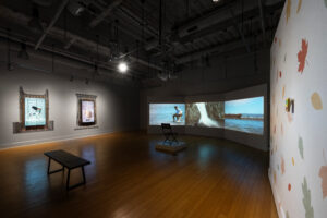
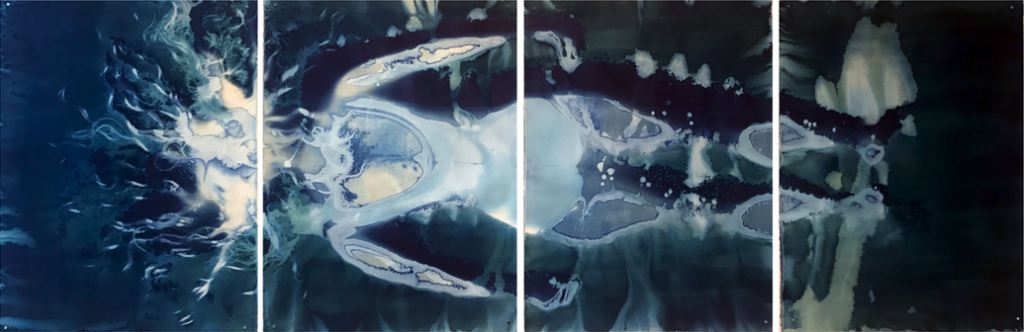
Cyanotype is an antique photographic process that was invented in the mid-1890s. Known for its rich Prussian blue color and ability to be applied to a broad range of non-traditional surfaces, including fabric, wood, and pottery, cyanotypes have sparked a renaissance in contemporary photography. Despite its newly discovered versatility, artists continue to be limited by this age- old practice, as the outcome can often result in a flat image, and the process imposes inherent size restrictions. Gray Lyons defies these limitations—her mastery of the cyanotype process has led her to create works over five feet in length, using innovative techniques that create visual depth and perspective through the manipulation of exposures. By using impressions created by her own body, Lyons’ relationship with the work enhances the aspects of storytelling, memory, and history. These messages relayed by her work are strengthened through the medium of cyanotype, as they are “a (physical) record of the air, water, and sunlight on that day on that time,” which connects stories of the past directly to the present. The result is Lexicon; a body of work resembling a portal going into a watery world—or perhaps a glowing womb. The work was on view at VisArts from July 14 through August 27, 2017.
What is the process of creating a cyanotype
It is a process that can be done really si ply, and then become hair-pullingly complicated. It requires only two chemicals, but once you learn to coat the paper effectively, it’s relatively easy to get a decent exposure. My wife always says, “It takes forever, and then all of a sudden it works.” I coat the paper with potassium ferricya ide and ferric ammonium citrate in even amounts, a number of times, in the dark. This combination creates a light-sensitive emulsion that you then paint onto whatever surface you are using. In the case of the images I have in the show, the base is watercolor paper
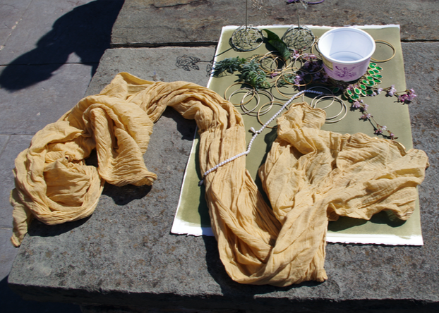
I coat the paper anywhere from three to five times depending on what I have in mind. The paper has to completely dry in between coats, so I’m usually standing in my studio in the dark for about 12 hours coating the paper. When the last coat is dry, I bag it up in opaque bags so that the light does not read through it. We then move outside; it then takes two people to lay it on a sheet of hard board so that it doesn’t wrinkle when I lie down on it. Most of the time I am just using my body on the paper directly to make the image. It also helps when it’s a really hot, humid, and sunny day; as you sweat it activates the chemicals, that’s when you can really depict every hair and pore on the skin. To create highlights, you push your body into the paper as hard as you can, so on those places where the contact is the hardest and no light can get around the body—that’s where it’s the lightest. Weight and pressure are essentially the same thing. Hair is really dense, so light reads around it instead of through it.
As I lay in bright sunlight, the coated paper begins to expose. In 25 to 45 minutes, the paper turns from a yellow-green to a silvery-brownish color. I always call it a ‘fox’ color, which probably drives my students crazy. Once it turns that color, I get up from making the impressions and wash out the iron sulfate by dipping the work in four kiddie pools. As soon as it hits the water, the work turns dark blue and the highlights are brought out. After it has been completely washed, it then starts to oxidize; within 24 hours, the color becomes a rich, deep blue.
Let’s talk about the message you want to communicate through your pieces. Do you think that cyanotypes enhance these messages in your work?
Oh, all of them. I went to art school and trained as an artist, almost all of my work has been silver prints (darkroom-based printing), but I have experimented with pretty much all of the ways to photograph. I wanted to make sure that I knew about all of the possibilities available, and to be conversant in each technique. However, I am not only attracted to the outcome of using cyanotypes; the physical process enhances the messages that I am portraying through my work.
There is not one particular overarching message that all of my work is about. In general, all of the pieces I make refer to storytelling, memory, and history. Because cyanotype is an antique process—it’s a historical process—it starts to make that reference automatically to the past. There is also a physical relationship with the environment in order to create cyanotypes. You can make the work in a really clinical way—you can make it indoors, under a bank of UV lights, and use a timer—but I love being outdoors. That moment of the unknown, where maybe it will go perfectly, or maybe the wind will blow and the paper will go flying across the yard and it won’t work out, or the sun will go behind a cloud and the image will change entirely; each image literally contains the natural world and natural elements. It’s a record of the air, water and sunlight on that day on that time.
Is there a deliberate reference to water or any other natural elements in your work?
Yes, absolutely. There aren’t any in the show at VisArts, but I’ve been working on a whole series of images about freediving, and the intelligence of the body overcoming its own physiological limitations. I’m really interested in water as something that contains us in the first months of our lives, but also, we contain it; we are made so much of water. There are ways to tone cyanotypes so that they aren’t blue anymore, but I’ve always really loved that deep blue that is maybe the ocean or maybe it’s the sky before it gets completely dark: it’s a darkness that is full rather than empty.
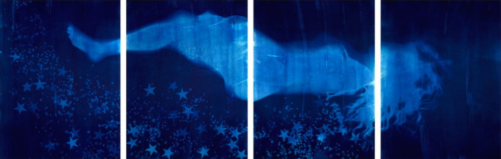
What is the narrative behind the work Reliquary?
The one with stars is called Reliquary, and that term is for the place where saints’ bodies are kept. That one is one of the more emotionally heavy images I’ve made in recent years. After Boko Haram had kidnapped all of those girls, it felt like nobody cared.* There were articles in the newspaper and on television, but it felt like it didn’t matter; we could talk about it but no one had any urgency to get these girls back. It made the point that it doesn’t matter what happens to women’s bodies, that we are just this renewable resource. We can be kidnapped, raped, and be killed and it doesn’t matter because there will always be more of us, we’re all the same. It seems that we are not valuable enough to be rescued. It just seemed that it was just another story and nothing was going to be done about it. So, I wanted to make the most sacred image that I could. The stars endorse the idea that women’s bodies are sacred, important spaces. Just as we are made of water, we are also made of stars, and I wanted to make a bed of stars to convey the importance of the female body.
*On the night of April 14th, 2014, 276 schoolgirls were kidnapped from their beds from the Government Secondary School in the town of Chibok, Nigeria by terrorist group Boko Haram, to be sold into slavery. There was a brief international outcry; conversation and awareness was spread by the twitter hashtag, #BringBackOurGirls, endorsed by Michelle Obama. As months passed, the anguish over the travesty disintegrated into history social media feeds. The western world seemingly portrayed the event as a hot topic, almost clickbait, and replaceable. (To learn more, visit www.bringbackourgirls.ng)
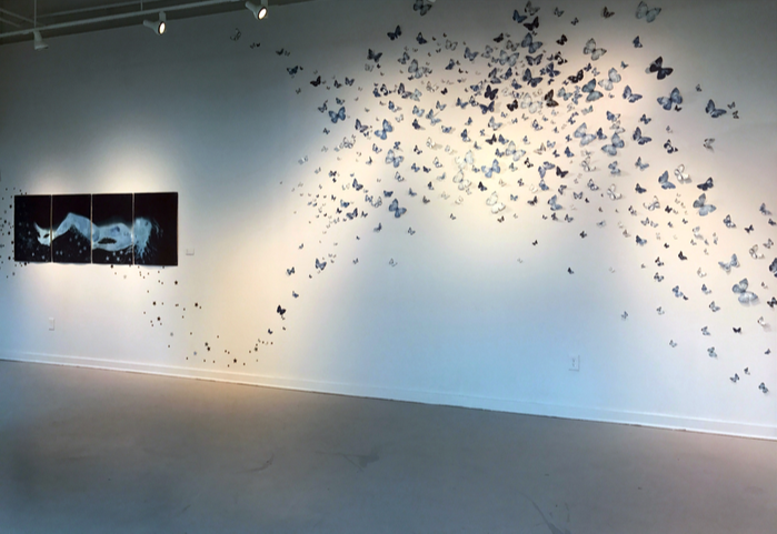
What is the significance in the butterflies displayed in Lexicon? Do the butterflies carry the same narrative as well?
No, but I like the idea of a visual conversation in between these two pieces through installation. I was interested in butterflies because of the romance of their migration. I was inspired by their flight behavior, with the notion that they live such short lives. So many die on the trip and so many are born that a huge number of them that haven’t seen where they have been, and won’t make it to where they’re going, but they are going anyway. I gravitate toward that idea that they are all going to together as a community. The ones that will make it will arrive having no knowledge of the previous place, and the same will happen in the other direction. I found idea of instinctive travel really interesting—that the travel does not benefit an individual, but the community overall.
This work was a collaborative piece with my wife, using photo negatives. I was given permission to visit the restrictive collection of the Field Museum of Chicago, and they have the largest butterfly collection in the country. It was really fun. I didn’t know that they would give me so much access; they let me take them out and move them around, and photograph them. We then turned those images we took into digital negatives, and then used a process of contact printing. That just means three direct contacts: you put the negative on the paper, then you sandwich in a printing frame, and then expose it in the sunlight.
In general, why is the show called Lexicon?
The word Lexicon is another word for vocabulary. I’m really interested in words and language in general; I am much more likely to be influenced by something that I am reading other than something that I am seeing. All of the words that you know, or all of the words contained in your community, is a branch or grouping of knowledge. I really believe that language is the way that we know the world. It’s funny because I was talking with a friend of mine about that a few days ago. She is also an artist and she said, “That’s not how I view the world at all; my first language is entirely non-verbal. As an artist I know the world through making and touching things.” But for me, I am always thinking in words, and then I try to find ways to tell a story or convey a thought that is composed of words as a visual item instead.
Do you see other artists using cyanotypes in a contemporary way?
Certainly. Since there has been more and more of a push for a digital output, there has been a push back, and a resurgence in an interest in antique processes like cyanotypes or tin-types. I don’t see other really large-scale cyanotypes, and I’ve not seen other people using their body directly to make the image. But, indeed, there is more interest in the use of cyanotypes than I think there was ten or fifteen years ago.
To see more of Gray Lyons’ work, visit www.graylyons.com