Interview with Amy Boone McCresh
Exhibiting artist at 355 Pod space from October 16 2020 – January 17 2021
interviewed by Iona Nave Griesmann.
The signifiers of status and class present themselves culturally in overt and nuanced ways. Logos of high fashion, cars, and grand architecture are predictable ways to display wealth, even if it is perceived. What about the subtle visual ways culture and society delineate class? Class is evident from the view outside one’s window, the level of access and choice in self-care, to the types of fabric in a home. I use an abstracted version of this materialistic visual vocabulary to ask questions that challenge classist structures, but also to tantalize with maximalist aesthetics. Highly saturated colors and a rich variety of textures create an initial attraction, while at the same time questioning assumptions of “good” taste. With this work, I push against the cross-cultural ideas of beauty and perception of class. This maximal and decorative aesthetic is partnered with detailed and hand-driven processes often associated with craft. The utilization of technology and digital components are combined with the handmade processes to create a direct shift in value and labor. These decisions aim to mimic the seemingly arbitrary lines that are drawn to signify cultural markers of luxury, mass production, and the defining features of access.
To kick things off, would you like to talk more about your pieces currently being shown in the 355 VisArts Pod Space?
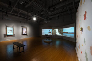
The piece up in the Pod Space is called Room With a View, and it’s a loose or deconstructed representation of interior and exterior existence, which I think has been on a lot of our minds right now, thinking about views out of our windows. Weirdly, last fall I started a series that was actually based around this idea of windows, and that was pre pandemic. I was thinking a lot about what the view out of your window says about your social status, class, access and position in the world. It says a lot if you’re looking at a brick wall, a parking lot or a beautiful garden. I wanted to capture it using the language of architecture and a fleeting environment, and then some abstract moments of color and light to have a conversation around that idea.
The Window, 2017, Wood, custom fabric, mixed media garlands, cut paper, 44” x 32” x 3”
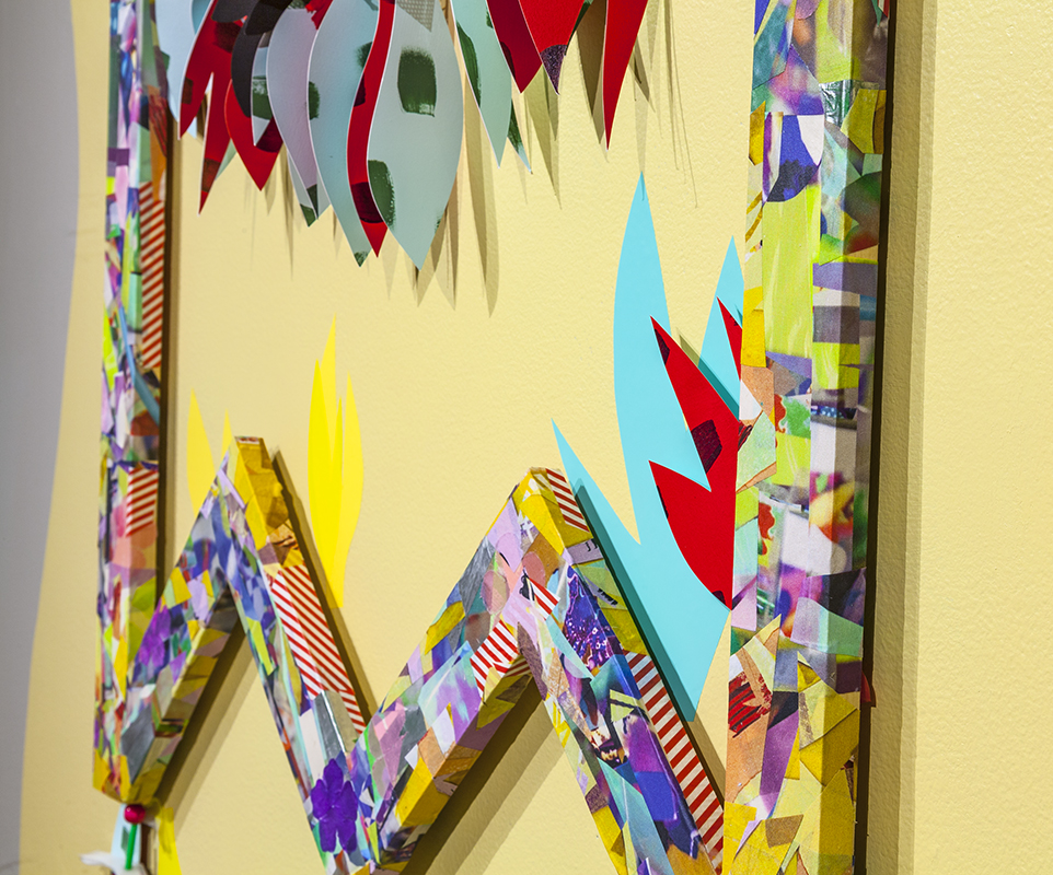
The Window, 2020, Detail
What are some of the thoughts or ideas you have that are specific to the themes of architecture?
During the pandemic I started photographing my own windows during the day. I live in a little carriage house in Baltimore city, and part of that carriage house looks into an alley which is pretty unappetizing to look at. It’s also an old house, so we have these really big windows which sounds really grand, but we actually had to put this frosted window vinyl on them so that people couldn’t see in. So we get all of these muted shadows and colors, and because I’m home all the time I was able to see how it was illuminated throughout the day; these few specific windows and how the light was changing. I just became hyper aware of that.
Some of the patterns you see on the silk in the window space are actually patterns made from those photographs of my own home and my own view. And then, the bars on the windows are kind of adopted into the language of the window shapes that are hanging in there as well.
I notice that frequently, and especially in your exhibition “The Artificial Order of Things” you employ motifs and elements of nature that are made from man made materials. Can you talk more about this juxtaposition in your work?
I’m always thinking about this idea of beauty; that it exists and occurs naturally, and we think of ways to harness it whether that means cutting flowers and having bouquets, or having a really beautiful yard. Even pets in a weird way are capturing beauty. It’s a strange way to think about something that’s already existing without us, and we are appreciating that beauty, harnessing it and holding it.
And who has access to that beauty? I watched Real Housewives for a season; I think it was Los Angeles, and one of the women had this massive bowl of fresh lemons and limes from her garden. And I was like “wow, just to have a massive bowl of fresh lemons and limes from your own yard for you to use and display in all of its glory is such a wealthy thing”.
I guess the sub context here is that I am a first generation college student, my mom was an immigrant and I grew up pretty poor. I guess I’ve had this hyper awareness of how people display wealth even if it’s not deliberate, obvious or intentional. Like how fresh food is actually an issue of access.
I’m also really interested in interior spaces and design for the same reason. How we decorate our spaces, what do those spaces look like, what is the ceiling height, what are the windows. And also the way that we live indoor and outdoor space really says a lot about us as people, as a society, as cultures.
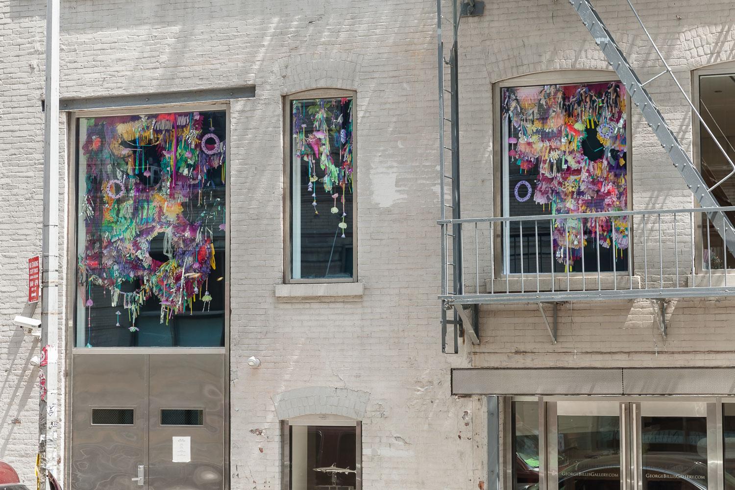
The Artificial Order of Things, 2015, site-specific window installation at Mixed Greens gallery, NYC
The Artificial Order of Things, 2015, Detail,
Learn More about The Artificial Order of Things
Have you always had questions on how decorative choice connects to class and status? Or have you had any experiences that drove you to ask questions about these topics?
Like I said, growing up in home that was not really of means. It was my sister and I, my mom worked three jobs and she wasn’t a citizen until I was in elementary school. At a very young age I was really aware of what we had and did not have; you know when you visit someone else’s home or go on a field trip.
I guess I didn’t realize this until quite recently, but that has always been the root and the driving force in my work. Like “why am I so obsessed with these things, these markers of taste, class and access?”, and it’s because that’s always really been prevalent in my life. Deconstructing what that looks like, how it manifests has been interesting. So that is what I’m always minding, but I don’t know if that would be immediately obvious to a viewer.
Are there any other non obvious ways of wealth you have noticed, or have even decided to address in your work?
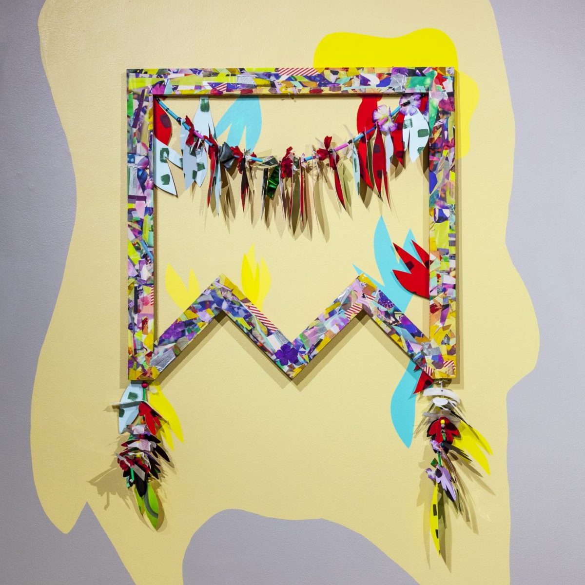
For a while I was looking a lot at bags and handbags-and I have a lot of pieces that aren’t geometric, a lot of my works on paper are organic cut shapes. For a while I was using this loose form of a handbag as a way that the work didn’t need to be bound by geometry, and it could embody a shape, but it didn’t need to be super specific.
Within the bags, I was thinking about how a couple years ago there was a runway show, and there were these bag charms, puffy key chains that you would put on the bag. There was Moschino and Chanelle, and they had their own versions that kind of looked like luggage tags. I think they actually even called them charms. But the price of one of those is like 2,000$, which is crazy to think about! Its an accessory, a stupid thing that you put on the bag. So in some of my works on paper, I started making charms for my own work. I would make these separate little hanging pieces and I would attach them to the works as an adornment or an additional charm, an accessory for my own work.

Vanity Wall Hangings, 2019, digital print and mixed media on silk and vinyl, custom steel brackets, acrylic and mixed media charms, 64” x 39” x 7”
Vanity Wall Hangings, 2019, detail
I think something else that’s interesting to me is this idea of taste. I guess as an artist-or artists in general- have this weird ability to be in a room with collectors and politicians, but they could also be in a room with your average working person. In mingling with people outside of what I grew up with, I realized that they have a really strong sense of what is good and bad taste. And it’s a real herd mentality, like “oh why would you ever choose that wallpaper? It’s such poor taste.”
Like a really decadent Chandelier, what is the line in between it being good to tacky? So I like going over the line of maximalist design and color. I like playing with that idea of using color, decoration and maximalism as a way to kind of poke at the thread of what is good and bad taste, what is accepted and what is tacky.
I also talk a lot about that with students when I teach color theory and design at MICA. I like to have conversations with them about how their attraction to certain color palettes is valid, and might be culturally influenced or influenced by your family, and that’s okay. It doesn’t need to be based entirely on color theory, and what’s right.
When you talk about your way of teaching, I find it very interesting how you encourage your students to find their own styles of color, rather than teaching your own aesthetic or automatically lead them to what is “ objectively correct.”
Yeah, and also finding your own colors as an artist after school. I talk about this a lot with a painter friend, but I feel like I can’t escape my color palette even when I try. I think a lot of people feel that way, like there are recurring colors that they always use, that they are always attracted to. And I got a lot of flack in grad school, like “you need to chill with these colors, it’s too much.” And it took me after grad school to realize “oh, that’s the point of my work. It is too much, and maybe I can use this color class as a way to have a conversation.”
While your compositions are very busy and colorful, they also still have a focal point and a sense of restraint at the same time. How do you utilize your knowledge of design and art to strike a balance in these two elements of your work?
I wouldn’t say that it’s even deliberate or intentional anymore, I think it just happens from years of teaching and from years of doing. Like, I can look at a piece and say “this isn’t right, I can’t put my finger on why”, but I think I have a strong sense of composition just from teaching and constantly thinking about that. And it’s a lot of trial and error for me.
In Extension in color theory, I notice the amount of color that exists in the piece; how much surface area is that color covering? If it’s all very much the same, there’s nothing to rest your eye on, I try to have areas that are a larger swatch of one color, or a larger shape and play with scale. But to answer your question, I don’t even do it intentionally now, it just kind of happens from teaching and working for so long.
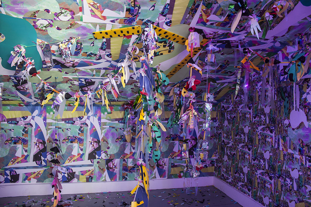
Too Loud, 2017, Custom mixed media garlands, vinyl, paper, and sound. Audio of extinct birds layered and mixed by artist on 10 minute loop part of the group exhibition “Birdland and the Anthropocene”
Too Loud, 2017, detail
Your material choices very frequently, also give your sculptural work a sense of being very delicate, or even temporary. Are there any metaphorical purposes in the materials you choose?
I actually try to deliberately use accessible materials that are even cheap or easy to find. For the window piece at VisArts, I used sheets of insulation foam which are readily available at a hardware store. Typically I would’ve gotten these cut with CNC, and because of the pandemic I cut forty by hand; and they are not small. That was a little bit problematic because I wouldn’t say I’m super interested in craftsmanship. I’m kind of a fast worker and it’s not my strong suit.
Art doesn’t always need to be permanent, and I really had to come to terms with that for this window, because I didn’t have them cut from CNC and there were no facilities available within the time I needed it. I think in embracing that, there’s something to be said for the ephemeral or the temporary, and using materials that could break down or are not slick like metal. I was even using laser cut acrylic for a while; and I still cut acrylic, I think it serves a purpose. But in a way sometimes I feel like it’s almost too slick, and I have to kind of ride that line of “what are the materials, are they detracting from or adding to the conversation?”
You also mentioned that you use digital mediums for some of your pieces. Does this enhance your workflow or practice in any way?
For a long time I was really technology resistant because I was a fine arts person, and then I started to think, “well maybe I’m closing doors on myself for no reason.” Our contemporary lives are so enmeshed with technology, and my work is about existing today. For most artists in some way, their work is about existing in the world now, right? So it started to make sense for me to not only think about a digital aesthetic as a way to reference that, but also as means of reproduction or repeat. So I started getting wallpaper and fabric printed, and using them in my installations. I don’t want to hand paint 30 feet of wallpaper, but I do really like this little cropped portion of this drawing or collage I made, so I’m gonna scan it, mess with it in Photoshop, repeat it and get the wallpaper printed.
I’m into world building and I like to talk to my students about, “what is your world and how do you make it?”, and that’s another way for me to immerse people in my world. Being able to get repeats printed and make patterns was also helpful. And then laser cutting technology has been helpful for sheets of colored acrylic.
In my artist statement I also talk about the shift of value in labor. So when something is reproduced digitally, or repeated many times, what is the value of that vs something made by hand?
What was the first piece you created that commentated on the ways cultural and class differences influenced decoration? How has your work evolved since then?
I think it was always happening, I just wasn’t aware until recently. Maybe that’s a weird thing to say, but I think after ten years of being out of Grad school I was like, “Oh! That’s what’s driving all this.” I was always kind of dancing around it, and honestly maybe the cultural climate allowed me to see that; the way I grew up, the way that the western world is structured and the way capitalism is structured. I’m always thinking about it and it’s coming out of me in my work, but I didn’t really understand how I was using color or referencing things in such a deliberate way. I feel like as an artist, the things that are so obvious later, maybe even really obvious to other people don’t reveal themselves to you for a long time. You have to just keep making the work even if you’re not sure why, and it will reveal itself hopefully.
In an interview with TemporaryArtReview.com, you state that you like to stray away from becoming too familiar with any one way of working. What do you do to make sure that your process stays fluid?
I think that the way I work is probably equal to my temperament. There are no accidents, I am not a super patient person, I like to work quickly and I only learn something when I need to. I’m not a process driven person. I even teach sculpture, but I know wood workers who are really into tools and everything down to the measurement, and are like “let me sand this for 8 hours”. That is not me. I need to work quick and direct, and I don’t want to get hung up on the process. I just want to get it out and work through ideas. So I think that my aversion to getting attached to any one process is probably tied to personality and way of working. I think I’m more “jack of all trades, master of none”. I wouldn’t say that I’m great or committed to anything, but I always want to figure out the best processes for that specific goal. So rather than being just like “ I’ll just make another work on paper,” I’ll first start to work it backwards like, “what is it that I want to say? Does it make sense that it’s on paper? Maybe it needs to be something else”.
I think for the window I did that as well. Rather than having a prescribed process that I already knew about, I decided to go out on a limb and try a relatively new material and have that speak more to the overall idea. I’d rather take a creative risk and learn something, or push my work forward than be really good at one thing and be stagnant. It’s hard and scary because there’s a lot of failure, and it’s hard to reckon with not being great at something when you’ve been an artist for a long time, but I don’t believe that’s what being an artist is about. I think when you get really good at something you tend to stop growing, so I try to throw wrenches in my own system.
To see more of Amy Boone Mcresh’s work, visit: amyboonemccreesh.com
This interview was conducted by Iona Nave Griesmann, an Intern at VisArts and current Illustration/Graphic Design student at Montgomery College. Their work can be found at @Iona_Nave on Instagram.